Driving Growth Despite Constraints
In 2024, I optimized the Toronto FC app, streamlining navigation and refining interactions. Initial results indicate a 20.6%+ increase in task success rates, along with improved retention and usability, while enhancements to Order to Your Seat continue to drive significant revenue growth YoY.
Design Lead - ’24/25
Laying the Foundation for Increased Fan Engagement and Revenue Growth
* These early results show significant improvements over the previous version of the app. We will continue tracking engagement and optimizing the experience as we gather more insights.
October 2024 - Feb 2025
Toronto FC fans rely on the app for everything from checking schedules to managing tickets and ordering concessions. However, after analyzing hundreds of user feedback submissions and app analytics, we uncovered a common theme: frustration.
Whether it was a casual fan searching for match details, a season ticket holder trying to sign in, or a first-time attendee navigating their game-day experience, the app made simple tasks harder than they should be. Key features like the schedule were difficult to find, the sign-in process felt disjointed, and revenue-driving tools like “Order to Your Seat” weren’t reaching their full potential.
Our goal was to streamline the experience, making it faster, easier, and more intuitive, while unlocking new opportunities for engagement and revenue.
One of our biggest challenges was working within the limitations of our CMS platform, which restricted our ability to build fully custom solutions.
Without the flexibility of a tailored development approach, we had to find creative ways to improve navigation, simplify key user journeys, and surface high value features, all while working within existing constraints.
This meant optimizing what we had, making smart design decisions, and ensuring every change had maximum impact without requiring custom engineering work.
We redesigned navigation to make key features easier to access, clarified labels for better usability, and streamlined sign-in with a single entry point to remove confusion. We also replaced the overloaded “More” menu with an intuitive structure that ensured fans could find what they needed with fewer clicks.
Additionally, we boosted the visibility of “Order to Your Seat,” a previously underperforming feature, by prominently displaying it on the homepage during games. This increased engagement and created new revenue opportunities.
Sections we’ll be covering

“Where is the schedule?” “This app is frustrating to use” “Why does this feel so hard?”
These were just a few of the hundreds of frustrated comments we found in user feedback.
Toronto FC fans rely on the app for everything from checking match schedules and managing tickets to ordering concessions and engaging with their team. But instead of feeling like a seamless digital extension of the game day experience, the app was frustrating fans at every turn.
The core features, the ones fans needed the most, were buried, confusing, or difficult to navigate. The sign-in process was fragmented, the “More” menu became a catch-all dumping ground, and revenue-generating features like ‘Order to Your Seat’ were vastly underutilized.
Our challenge was clear: We needed to redesign the experience, streamlining navigation, reducing friction, and unlocking new engagement opportunities while increasing revenue potential.
 Can’t find player stats
Hard to navigate
Not easy to navigate
Can’t find schedule
Hard to find articles
Not user friendly
This app is frustating to use
Hard to find roster
Make it easier to find things
Can’t find videos page
How do I login to chat?
Make stats easier to locate
Can’t find roster or schedule
Can’t find calendar view of schedule
Unintuitive navigation
Layout is hard to navigate
Can’t find membership central
Hard to see schedule
Navigation is frustrating
Can’t find schedule and live game info
Where is the schedule?
Can’t see season stats
Hard to find roster stats
When is the next game?
Old app was easier to navigate
Can’t find player stats
Hard to navigate
Not easy to navigate
Can’t find schedule
Hard to find articles
Not user friendly
This app is frustating to use
Hard to find roster
Make it easier to find things
Can’t find videos page
How do I login to chat?
Make stats easier to locate
Can’t find roster or schedule
Can’t find calendar view of schedule
Unintuitive navigation
Layout is hard to navigate
Can’t find membership central
Hard to see schedule
Navigation is frustrating
Can’t find schedule and live game info
Where is the schedule?
Can’t see season stats
Hard to find roster stats
When is the next game?
Old app was easier to navigate
What problems are we facing?
Redesigning the Toronto FC app wasn’t just about making it look more visually appealing, it was about overcoming deep rooted limitations.
1️⃣ A rigid CMS meant we couldn’t build fully custom solutions, forcing us to rethink how to improve the experience without heavy engineering work.
2️⃣ The “More” menu had become a dumping ground, with users relying on it out of confusion rather than intent.
3️⃣ Key features like schedule, player stats and team stats were difficult to find, leading to frustration.
4️⃣ Sign-in was fragmented, forcing users to navigate multiple, unclear login options instead of a seamless entry point.
5️⃣ Revenue-driving features like ‘Order to Your Seat’ were underutilized.
With no flexibility for major backend changes, we had to maximize impact using smart design decisions, simplifying navigation, rethinking menu structures, and making high value features easier to access.
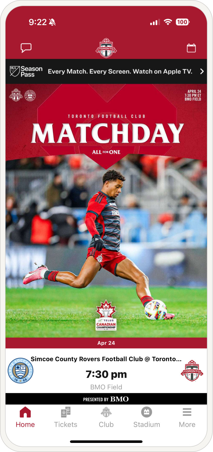
Before - Home Screen
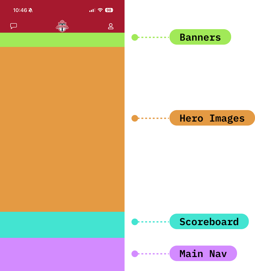
More than 65% of the screen is occupied by the main image and banner, pushing the box score and other key features out of view.
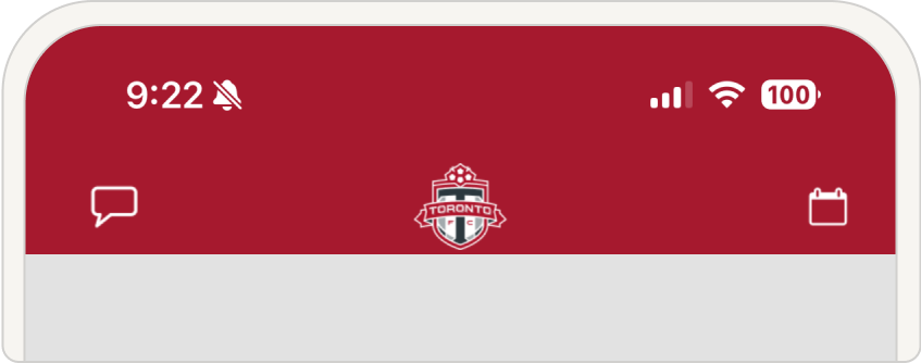
Before - Header
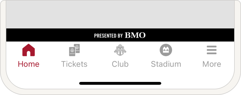
Before - Nav
The header featured two main buttons, Chat and Schedule, both unlabeled, making them difficult to identify.
The main navigation included four primary pages plus a ‘More’ menu for additional options.
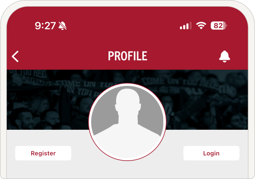
Before - Profile
Before - Tickets
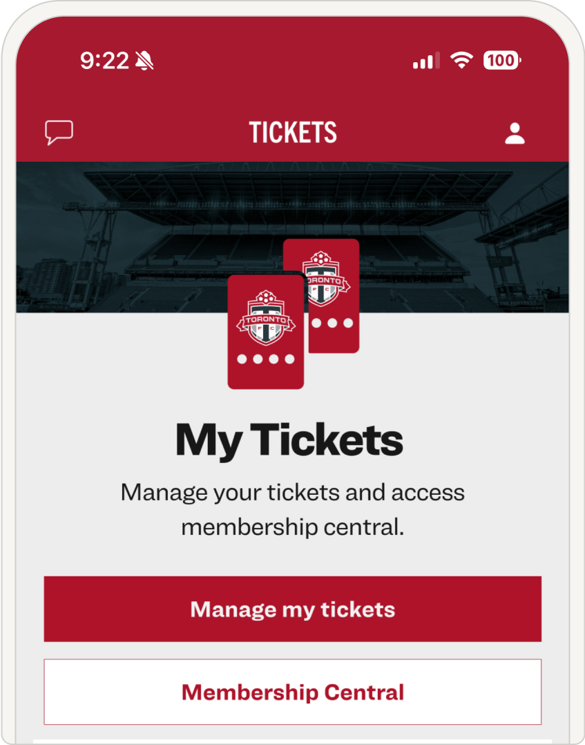
Sign-in Flow: The app had three different sign-in methods (Ticketmaster and in-app), creating confusion. To log into the app, users had to dig through the buried profile page to find a hard to spot “Login” button.
Meanwhile, on the tickets page, both “Manage My Tickets” and “Membership Central” redirected to Ticketmaster, making the process even more complicated.
Before - More Menu
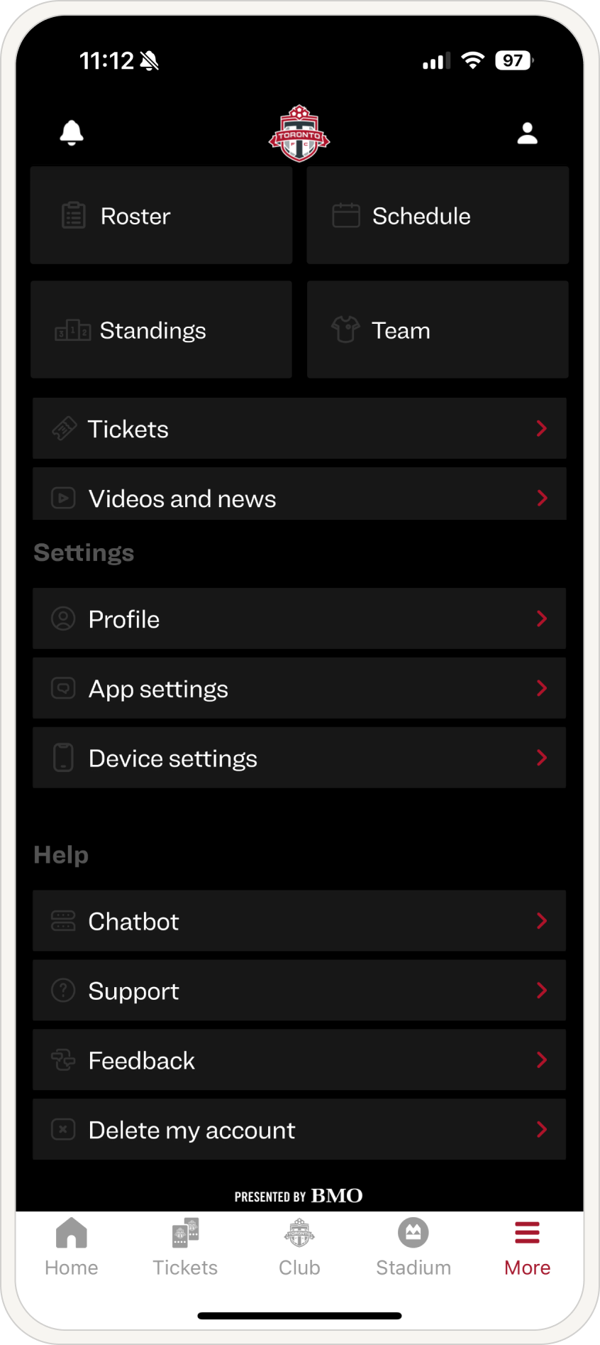
The ‘More’ menu became a cluttered catch-all, growing increasingly unorganized and overwhelming over time.
Where do even we start?
With so many pain points, it wasn’t about making small tweaks, it was about rethinking the entire experience from the ground up. We questioned EVERYTHING.
🤔 Why was the ‘More’ menu the fourth most clicked page? Were users conditioned to check there, or were they simply lost?
🤔 Why was something as essential as the schedule buried? It was a top five feature, yet hard to find.
🤔 Why was sign-in so fragmented? Three different login options led to confusion instead of clarity.
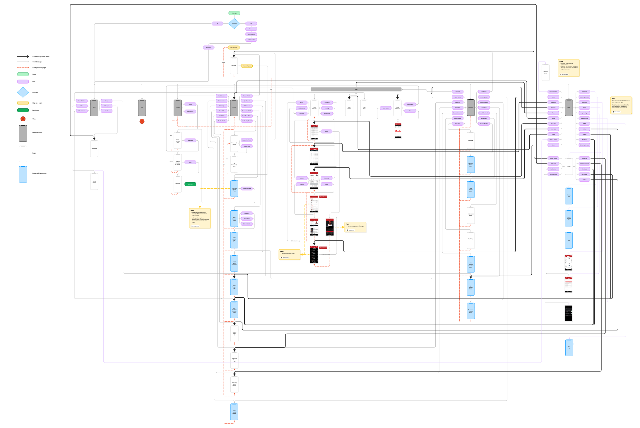
We mapped out every page, every flow, and every dead end. What was necessary? What was redundant? What was broken? By laying it all out visually, the complexity of the problem became even more apparent. But with that, the path forward became clearer: strip away the noise, surface the most important features, and create a structure that just makes sense.
Before - Sitemap
This complex web of paths represents the current sitemap. Mapping out every page and its navigation flow was eye opening. It exposed dead ends, unnecessary complexity, and areas in need of optimization.
- Home - 383,366
- Tickets - 149,362
- Scoreboard - 74,938
- More - 62,236
- Schedule - 49,146
- Player Stats - 37,672
- Team Stats - 32,693
- Profile - 17,147
- Stories - 15,964
- Stadium - 11,969
Top 10 pages
Note
The biggest red flag so far?
The ‘More’ menu is the fourth most clicked page in the app, used by 62,236 users over a one month period searching for… something.
The ‘More’ menu should be for overflow content, things like user profiles, app settings, and secondary pages. Instead, users are turning to it out of necessity, struggling to find what they need. But are they habitually checking it because they’ve learned to expect key pages there, or are they simply lost?
Right now, it’s unclear, but it signals a deeper navigation issue.
Note
What are the core features of a sports team app? What do fans expect? By working with our data analyst, we identified the most used features and gained a clear understanding of user priorities. With these insights, we began designing new journeys that bring these key features to the forefront.
Problem areas are starting to emerge with the help of analytics.
Before
Revised
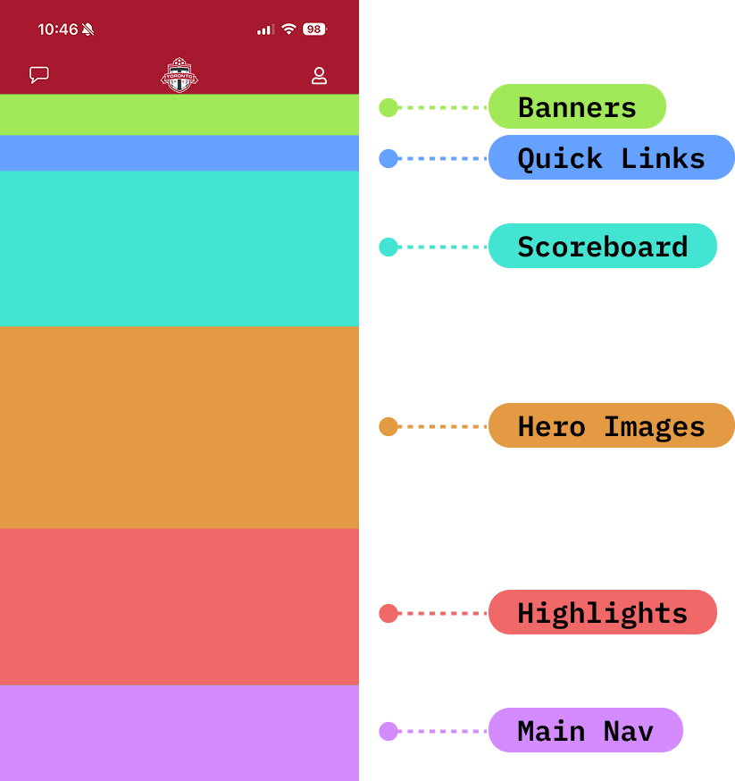
Let’s start blocking out the content and see where we are. The current version has the scoreboard cut off and the main focus is the hero image.
Now is the time to experiment. What if we reduce the hero image? Move the scoreboard to the top? Add a ‘Quick Links’ section featuring high value actions like ‘Order to Your Seat’ a key revenue driver? With these changes, we’re not just optimizing space, we’re putting more relevant content in front of users, making the homepage more tailored to what fans actually want.
Adding Schedule
Updating icons and removing “more”
Let’s go back to the main nav for a moment. One of the biggest complaints we saw is that the schedule was difficult to find. The schedule is #5 for most viewed pages, it needs to be easy to locate. Let’s try adding it to the main nav. Perfect! but what if we removed the “more” option for a moment.
Looking better! “Club” felt very vague… Everything inside of it consisted of stats, let’s try a clearer label. Now let’s just quickly make these icons match.
The header buttons were underperforming, largely because they lacked labels and blended into the design. To address this, we removed the ‘More’ button from the main nav and transformed it into a structured menu, now positioned in the header. Additionally, we labeled the Chat button and moved it to the right, keeping in-game experiences just one click away.
Before
After
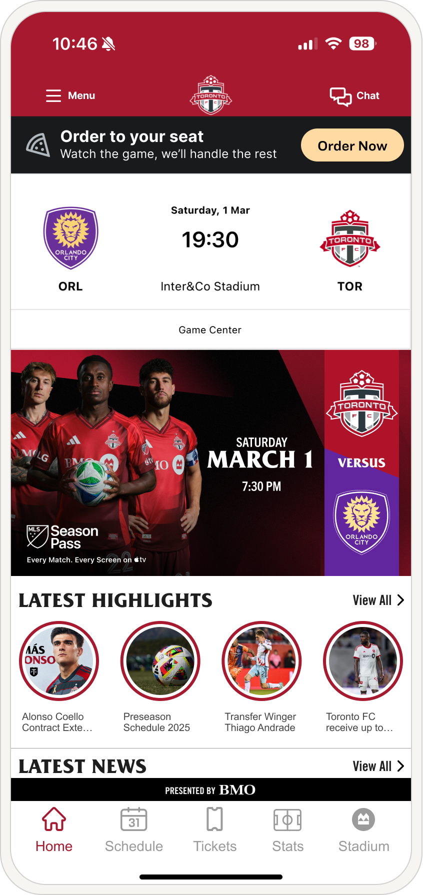
Let’s compare the before and after. By moving the Apple TV Season Pass info inside the hero image, we freed up the top banner for ‘Order to Your Seat’, a key revenue driver. Now, the scoreboard is fully visible, highlights and news are surfaced, and the header buttons are clearer. Most importantly, the schedule is now in the main navigation, making it effortless to find.
🎯 Executing the Game-Plan
Redesigning is one thing, proving it works is another.
Before launching, we needed to validate our decisions through usability testing. Were we actually solving the right problems?
👉🏼 Would fans find the schedule faster?
👉🏼 Did the new navigation make key features easier to access?
👉🏼 Would the streamlined sign-in flow reduce confusion?
We put our prototype in front of real users, tracking how they interacted with the new design. Every click, hesitation, and frustration gave us valuable insights, confirming what worked and uncovering areas that needed fine tuning.
Schedule
Increase (68.4% → 93.2%).
Highlights
Increase in success rate (61.8% → 82.4%)
Stadium
Decrease, (71.1% to 70.3%)
News
Increase (80.0% → 93.2%)
Chat
Increase (69.7% → 81.1%)
** The Stadium flow did not change locations in the redesign, so the slight decrease in direct success rate (71.1% to 70.3%) is to be expected. Different users participated in the tests, which naturally introduces some variability in results. Since the flow remained unchanged, this small fluctuation doesn’t indicate a usability issue. Instead, it highlights the stability of the design and its ability to perform consistently across different user groups.
Usability Results: Current vs proposed design
We first gathered baseline metrics from the current design to establish a benchmark, as shown in the results above. In testing, the proposed design outperformed the existing version across all key areas. Our initial evaluation focused on five core tasks that had previously underperformed.
But what about the sign in flow?
A total trifecta of confusion… so what’s the deal?
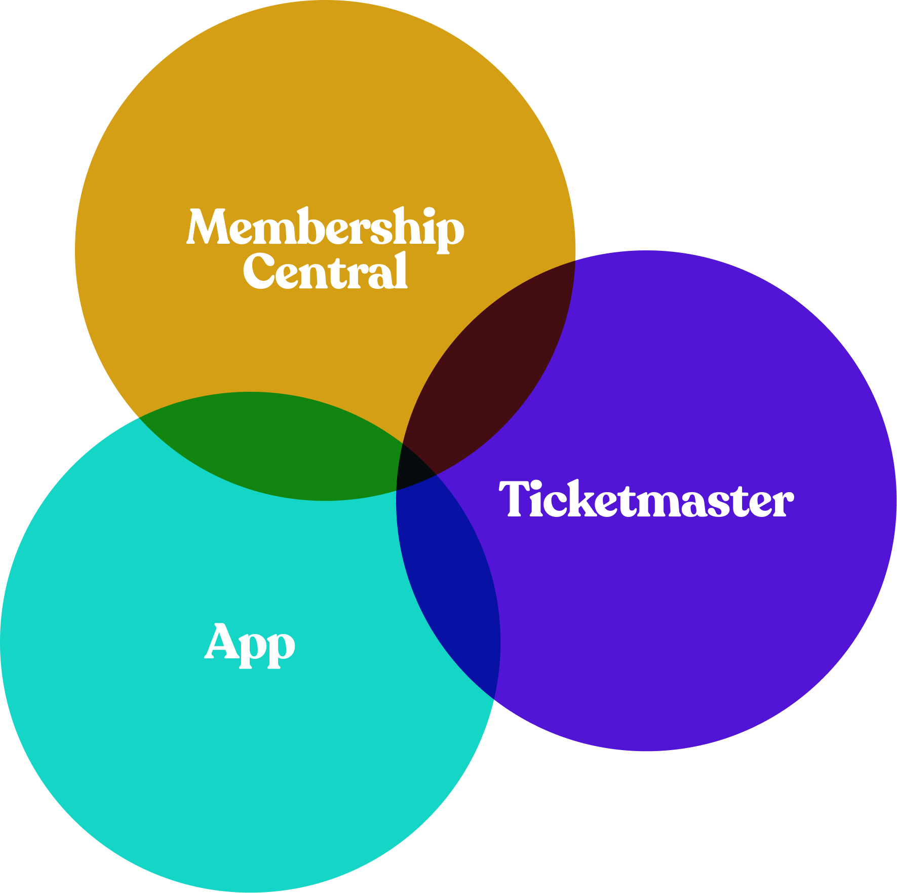
Most apps keep sign-in simple with a single option, but we don’t have that luxury. We need to support two separate logins, one for Ticketmaster, which handles in-person ticketing, and another for the general app, allowing non ticket holders to engage with fan experiences.
Both must be available, but the real challenge is making the process seamless while clearly communicating both options especially since some account features overlap.
Before: Tickets
Before: Profile
‘Manage My Tickets’ and ‘Membership Central’ are both featured on the Tickets page, yet both buttons lead to the same destination, logging the user into Ticketmaster.
The ‘Login’ button on the profile page serves a different purpose, it signs users into MLSE (the app), enabling access to additional features unrelated to ticket management.
Proposed sign in flow
After: Menu
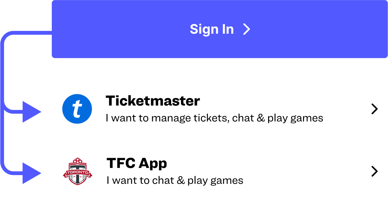
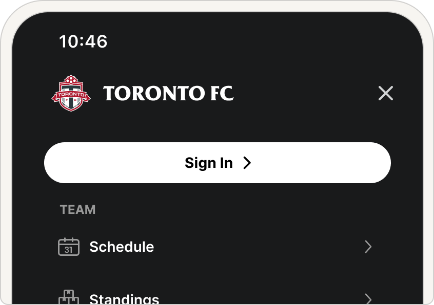
One of the first things I wanted to explore was consolidating the fragmented login experience into a single entry point. Instead of three separate login options, a single ‘Sign In’ button would guide users to choose whether they’re signing into Ticketmaster or the app.
Adding the sign in button to the top of the menu made sure that it was accessible from any page within the app. The tickets page also featured a single sign in button that bypassed the secondary page and immediately logged you into Ticketmaster.
Before: More menu
After: Updated Menu
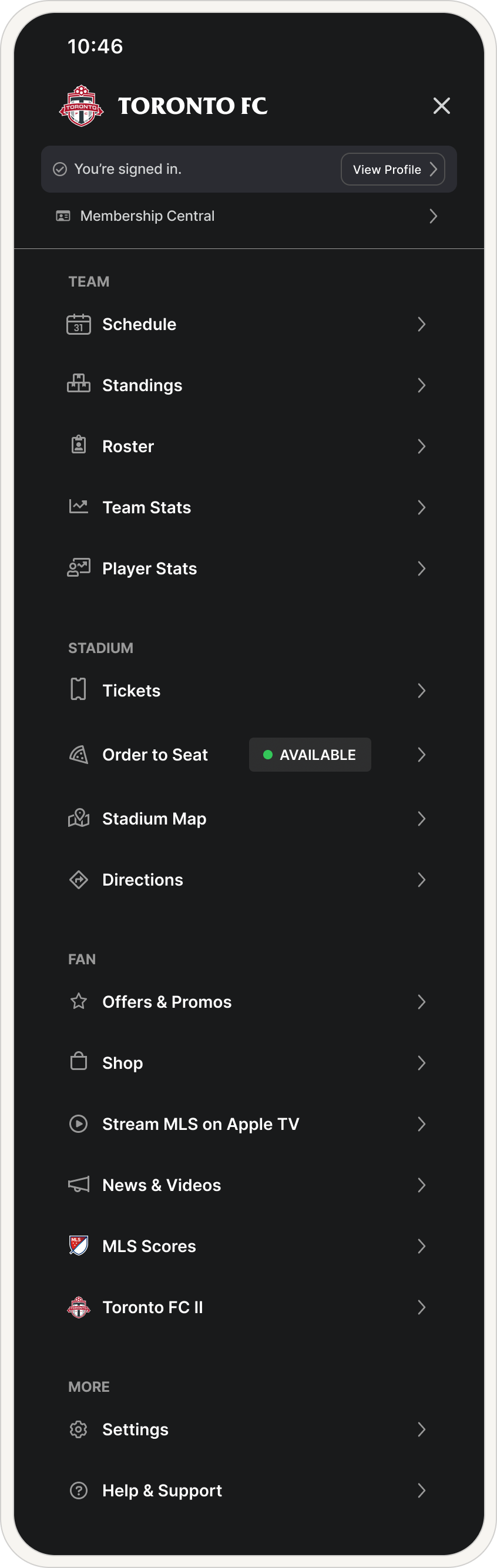
Here’s a before and after look at the ‘More’ menu overhaul. Previously a cluttered catch-all, we’ve now grouped similar items together and prioritized the most sought-after features at the top, making navigation more intuitive and efficient.
Finally made it to your seat... but you forgot food.
Order to your seat saves the day.
Early data confirmed that ‘Order to Your Seat’ was a major revenue driver, so we prioritized refining its visibility and appeal. We fine-tuned the copy, color, and overall design to ensure it stood out and drove conversions. To validate our approach, we conducted multiple A/B tests, what color stood out? What copy was easy to read but also conveyed everything they needed to know? We did a lot of testing before coming to our final design.

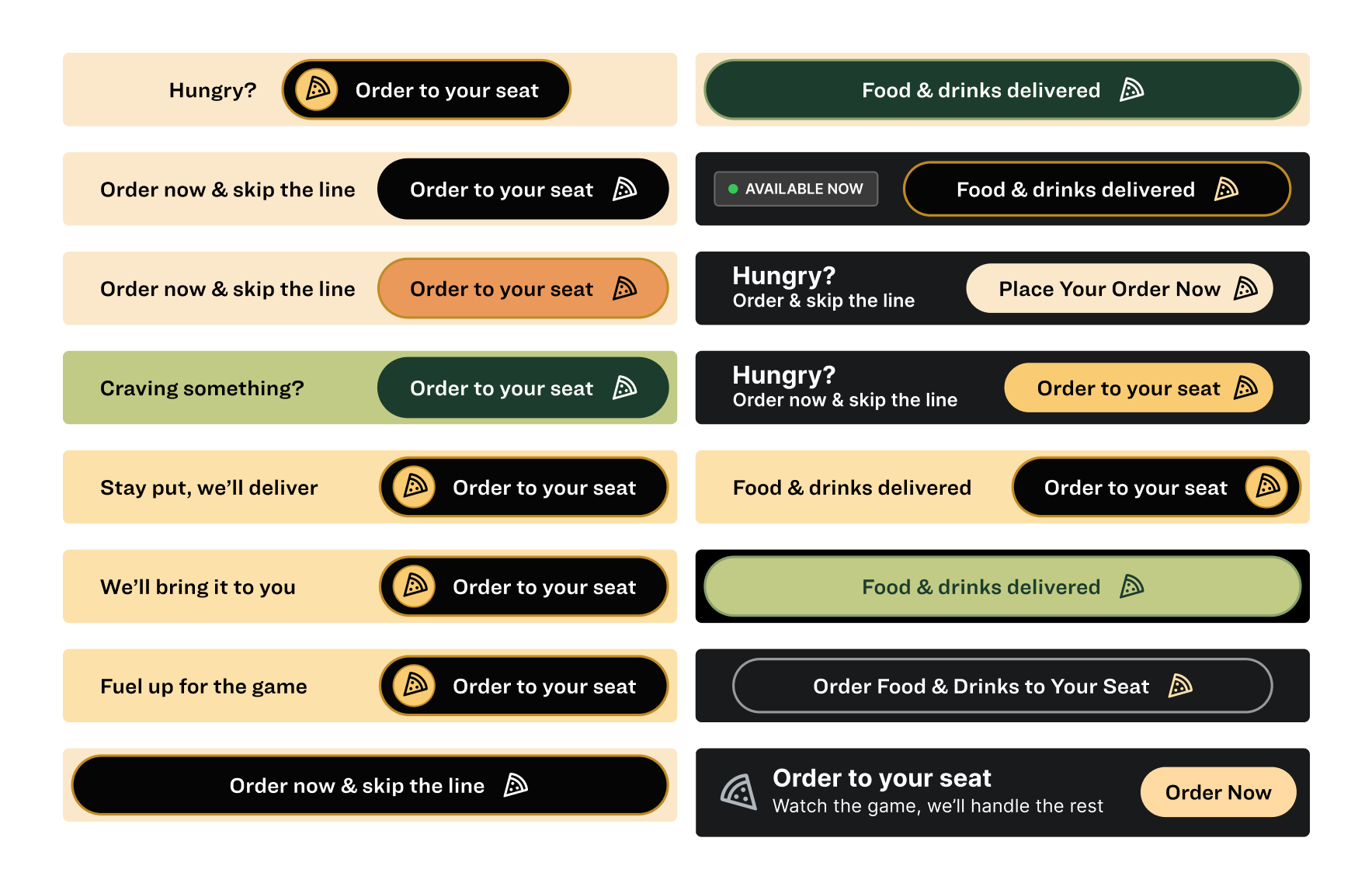
Multiple variants for Order to your seat
Post-game analysis:
What we learned.
Our updates not only improved usability and streamlined navigation but also drove greater engagement with revenue generating features. Early results showed a significant boost in task success rates, making it easier for fans to find key information and interact with content.
By enhancing the overall fan experience, we’ve set the stage for expanded revenue opportunities, from in-seat ordering to merchandising, while improved navigation increases the visibility and value of ad placements and sponsorships.
With this foundation in place, the next step is to evolve beyond navigation improvements and reimagine how fans engage with the app on game day.
So, what’s next?
This redesign was just the first step in transforming the app into a more engaging, revenue generating fan experience.
Next, we’ll focus on optimizing in-game engagement, making scores, stats, and key features more accessible in real time. Our goal is to position the app as the ultimate digital companion for every Toronto FC match, enhancing how fans connect with the game before, during, and after the final whistle.