


Thirty percent in 2020. Six when I picked it up.
Refer a friend, they get a free box and you get credit: a familiar exchange used by banks, gyms and phone companies. In 2020 it brought HelloFresh 30% of its new customers.
By the time I picked it up it brought 6%. It still cost $12.7M in rewards in 2025, and the number of referrals was falling about 20% a year. The decline also showed up earlier in the journey: a smaller share of active customers reached the referral page.
Leadership set the turnaround goal. Working with my PM in the Share Squad, I shaped the experience strategy and personally designed the referral page, sharing experience, friend landing page and shorter signup. The Growth Squad built the friend’s side; delivery depended on both teams.
My scope ran past launch: a reusable offer component for campaigns and markets, and a research-led review of what to build next. The challenge was to make an offer customers felt comfortable sharing while giving the business room to test its incentives.
Visited the referral page
17.83% 10.45% −41%
Share of active customers · North America highlighted
The page was a problem. So was everything after it.
I followed the offer from both ends.
You send “a free box” with no insight as to what’s inside. How many meals? For how many people? Is there a catch? I genuinely had no idea.
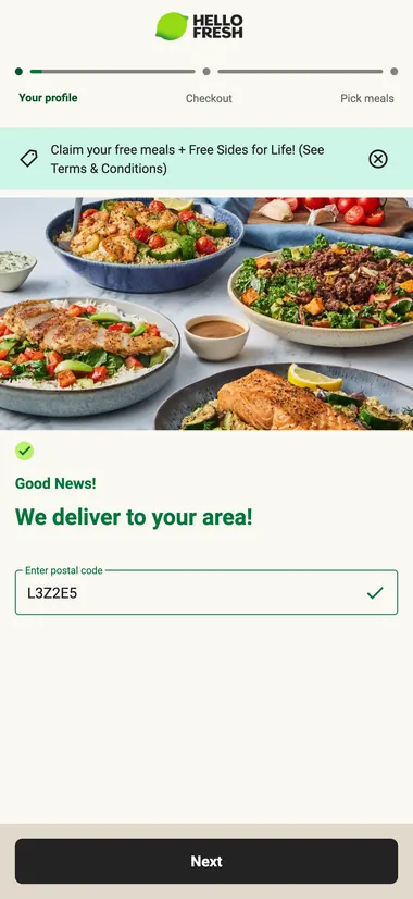
Your friend clicks and faces 21 steps to sign up. Plan, household, address, delivery day, and at step 21 a card. Only after paying do they see a single meal. The menu, the one thing that might have sold them, is behind the paywall.
I sent a box to my mom. Turns out her box wasn’t free, and she ended up on a weekly subscription. I only found out a week later when she mentioned it to me.
Research gave that experience a wider context. In moderated interviews with seven US customers, six questioned what their friend would receive and what signup involved. A reward could make sharing attractive, but uncertainty about the friend’s experience gave people a reason to hesitate. One participant put it plainly:
“I don’t want to make a promise that doesn’t wind up being true. I don’t want to look bad to my friend, or have the guilt or shame of misleading them.”
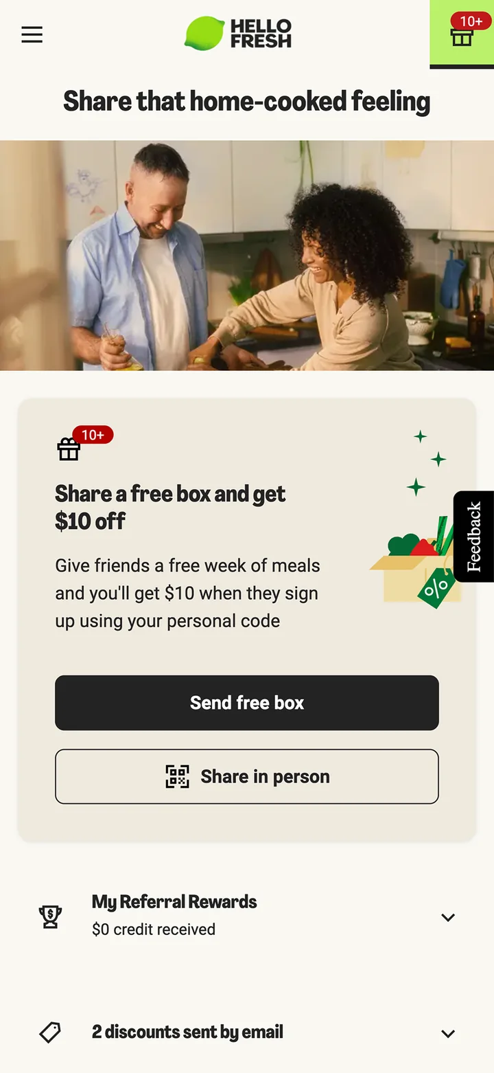
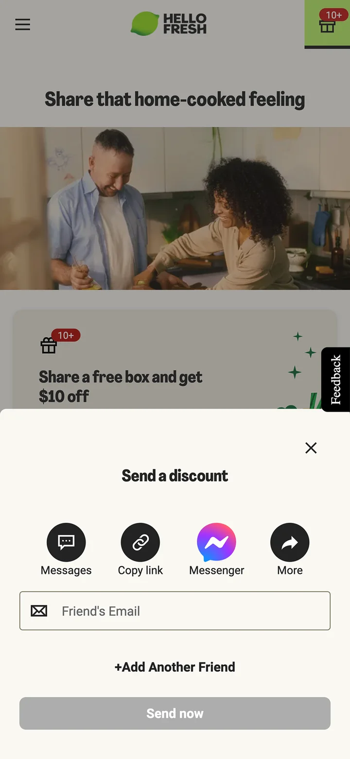
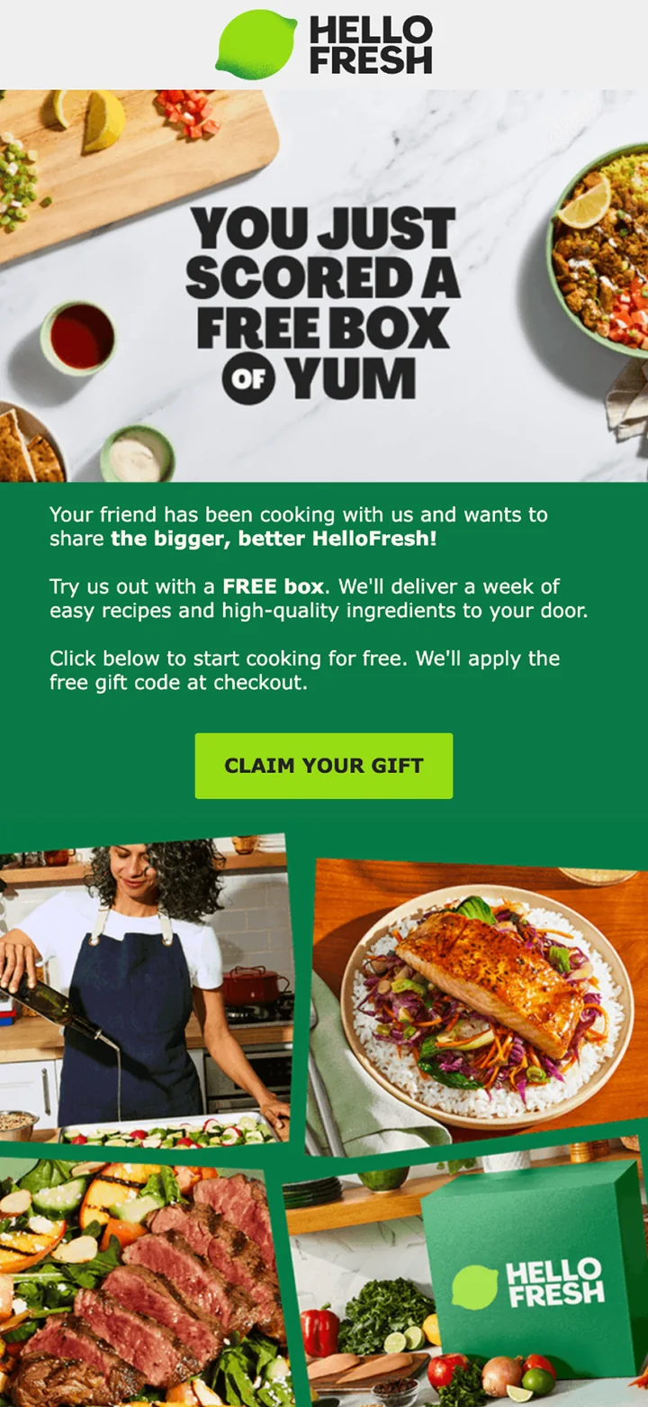
Your friend lands here. 21 steps later. A card is required and they still haven’t seen the menu.
 Friend lands here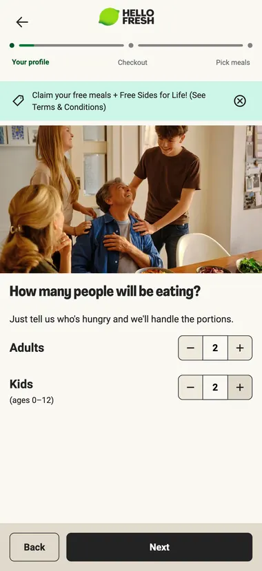
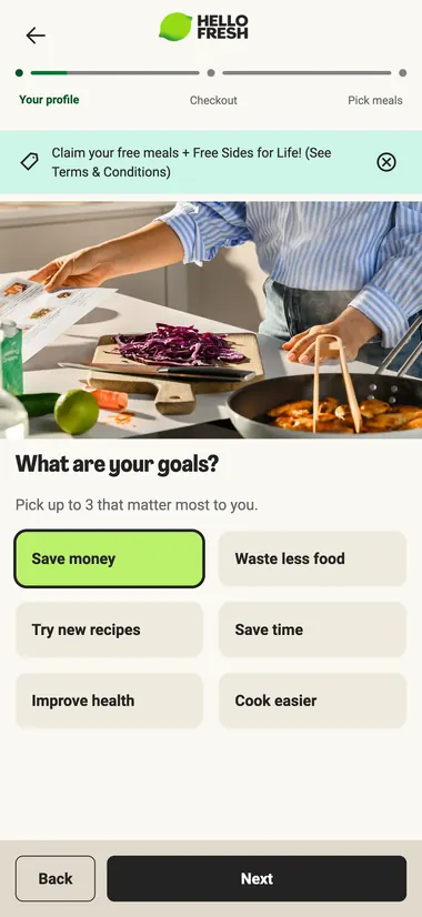
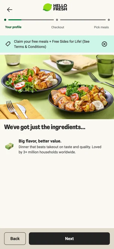
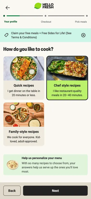
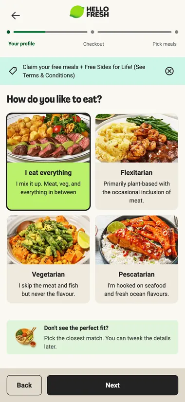
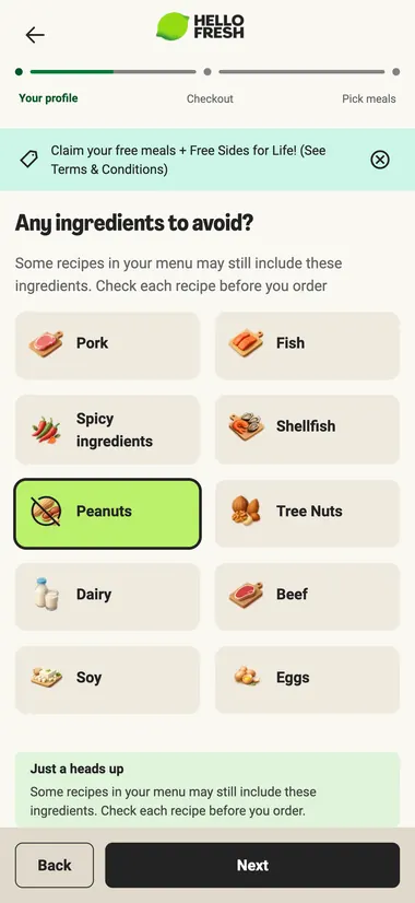
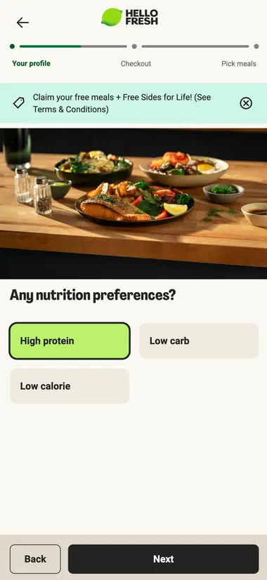
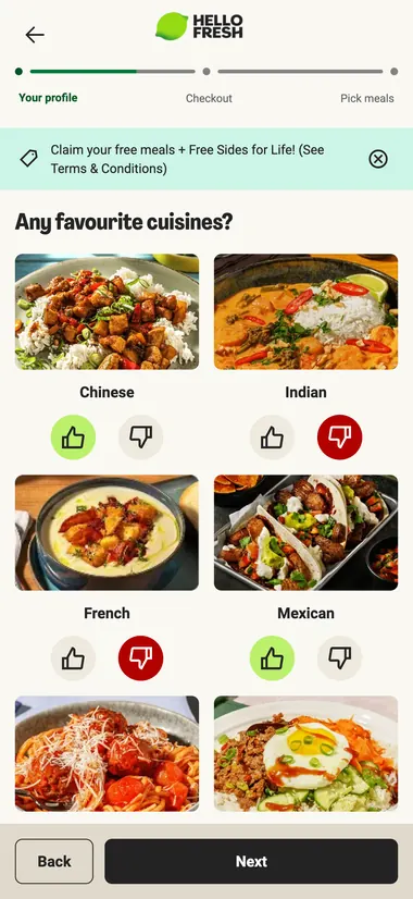
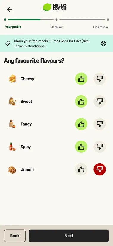
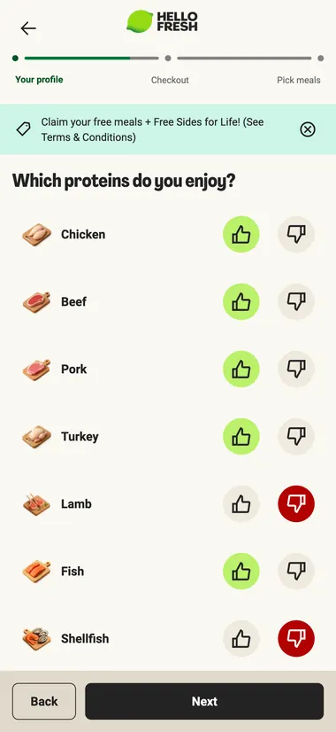
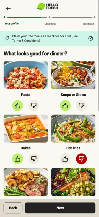
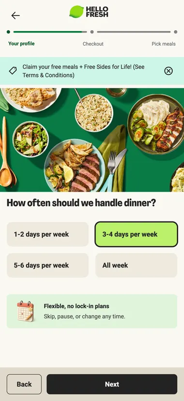
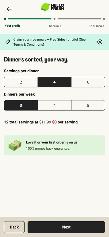
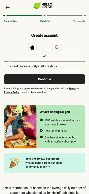
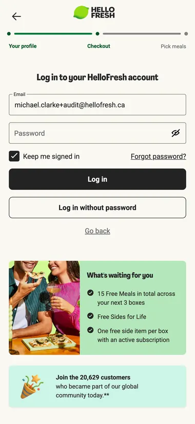
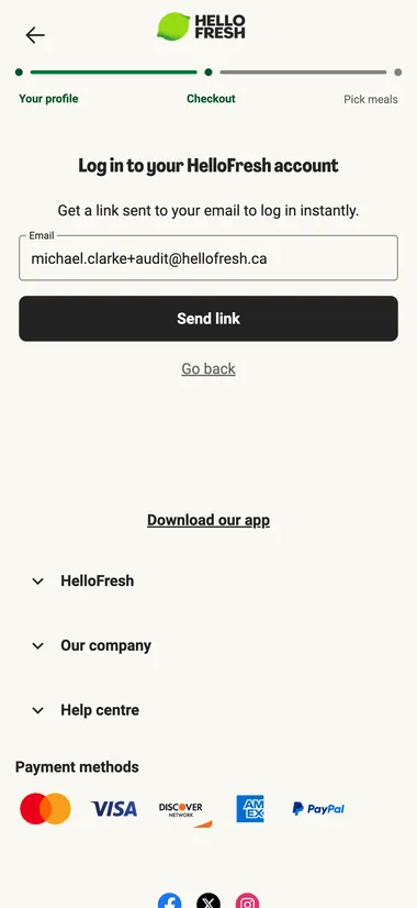
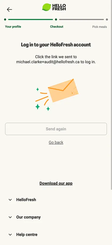
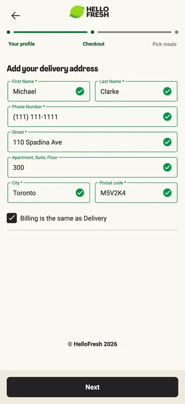
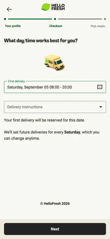
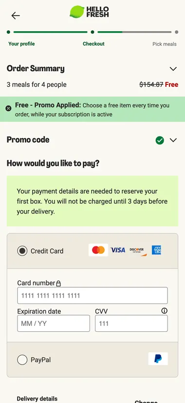 Card required. Menu after
Make the gift clear. Make sharing easier.
I treated the sender and friend as one journey. The sender needed to know what they were recommending; the friend needed that promise to survive the handoff into signup.
I designed a dedicated friend landing page and the signup experience behind it, which the Growth Squad built. The page introduces the person who sent the invitation, brings food into the experience before checkout, and explains the offer. The shorter Apple Pay path reduces the work of claiming it.
These solve different problems: showing the food helps someone judge whether HelloFresh is for them; explaining the subscription sets expectations; fewer steps reduce effort. A faster checkout alone cannot establish trust.
For the sender, I brought the sharing options together and made referral activity visible. The reward remained part of the experience. The design needed to explain both sides of the exchange, rather than assume that a larger incentive would answer the friend’s questions.
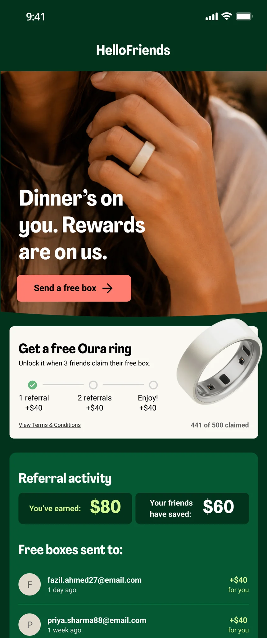
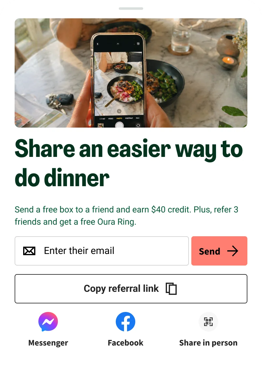


Put sharing where there is a reason to share.
I moved the invite to three moments: a box arriving, a meal rated well, and next week’s meals picked. That meant fewer prompts, not more. Other teams had started pushing back on referral popups across their screens.
Study 5 warned that none of the referrers remembered acting on a prompt, so we treated it as a bet. The prompt after meal selection went from under 100 invites a week to over 600, without anyone having to find the referral page.
Two of the three moments: after the week’s meals are picked (web and mobile web), and when a box arrives.
Keep the personal invitation. Give the offer room to work.
My first direction led with the gift, not the money. Leadership turned it down: the business needed incentives it could price, forecast and change. I’d asked for a new premise and a new mechanic in the same meeting. I kept the personal invitation and made the offer explicit instead.
One component, three states: credit, a guaranteed reward, or a raffle. Rewards replace the base credit rather than stacking on it. Same frame, same button, and the customer who has seen one has seen all three.

FIFA raffle · US
+10.7%
Invites, but $11,700 lost after prize cost
Fissler cookware · Germany
+15.7%
Conversions, with €5,646 returned after costs
One bought reach, one bought conversion. Judge a campaign on what it returns, not how many invites it makes.
More people shared. Growth took longer to follow.
What we can prove
>4.5%
Weekly US invites vs control, statistically significant
What the channel did
+20%
Weekly US invites, Q2 to early Q3
What it cost
9.7–12.6%
Invites that became customers, down from 15.4%
Everything was tested as one bundle, because platform migrations left no way to isolate changes. The lower conversion rate was a trade the team chose: a clean rate on a shrinking base is how the channel got to 6%. By late August, weekly US conversions passed the Q2 average for the first time, 1,658 against 1,318.
A program the team could keep improving.
One experiment used to take 60.5 hours to set up, and a creative change needed an app release. I designed the layer campaigns plug into, and the team rebuilt the platform underneath. Experiments now launch the same day. Germany launched by configuration, not a rebuild, and Factor is planned next.
My PM and I tested the roadmap’s eight ideas against the research before building any. Two survived: a box for an occasion, like a new baby or a move, and invitations earned through tenure.
Sharing came back. The harder question is who it brings.
After launch, the analytics team found that 52% of referred friends cost more than they brought in. The best predictor of a valuable friend was the sender: a referral from a long-standing customer was worth about three times one from someone new. That’s the channel, not the redesign, but it points the next build at earned invites.
My contribution was to connect the promise a sender makes, the experience their friend receives, and the mechanics the business runs. The next question is which changes bring in customers worth acquiring, not which produce the most invitations.